7 Reasons Your Outdated Website is Costing Your Business
I know this is a common experience.
It happens to even the best of us.
we want to update our website, but it’s not a priority. Our old site seems fine, but times change, and outdated websites can lose their appeal. Just like an old car, website designs and technology evolve. If you’re wondering if your site needs an update, here are 7 signs that your website is outdated and, consequently, costing your business. How many signs apply to your website?
Sign 1: An Old, Cluttered Layout
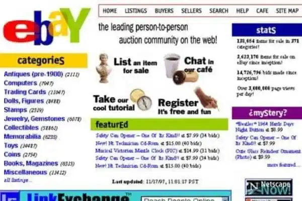
38% of people leave unattractive websites.
Modern designs are clean, comfortable, and easy to navigate.
Years ago, web designers used advanced technology to combine text and graphics on web pages. However, this led to websites being cluttered and confusing with information coming from all directions.
Thankfully, things have changed, and now customers prefer clean and easy-to-navigate designs. Websites should make visitors feel comfortable and at ease. One essential thing you want your customers to know is how you can help them. Ensure that your homepage clearly conveys this message using short and direct messages. Also, make sure your contact information is easy to find. This will help visitors feel they are in the right place and can quickly get the assistance they need.
Sign 2: Not Optimized for Mobile Devices
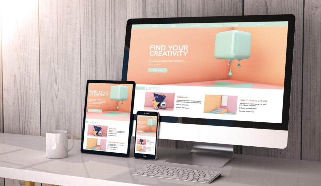
A mobile device is a small computer that fits in your hand, like a smartphone, tablet, or e-reader. There are billions of people who use the internet on their mobile devices. We use them to check email, social media, and do lots of Google searches. When people search for a business on their phone or tablet, 88% of them either call or visit that business within a day.
The problem is that many websites only work well on big desktop computers because they haven’t been updated for mobile devices. Since mobile screens are smaller, the website’s content and buttons need to adjust to fit properly. For example, a button that’s easy to click with a mouse might become too tiny for someone with big fingers to tap on their iPhone. This can be frustrating for potential customers, and they might leave your website to find a better one. To avoid losing customers, it’s important to make your website work well on mobile devices too.
Sign 3: Outdated Information

Making small updates to your car, like changing the brake pads, can bring significant benefits. New brake pads ensure safety and prevent more expensive damage to the entire brake system. The same idea applies to your website.
If your website has outdated information, it can confuse visitors and even make them think your business is closed. Let’s imagine you have a landscaping service, and you gave out business cards to your customers. But then, your phone number changed. Now, you need to print new cards and other promotional materials, which is a hassle and costs money.
Now, one of your favorite customers needs to contact you, but she tries the old phone number on the business card and can’t reach you. She thinks of searching for your contact details on Google, but she finds the same outdated number on your website. Because it’s difficult to get in touch with you, she ends up hiring someone else for the job.
Sign 4: Blurry or unclear Pictures

Adding pictures to our content makes it more appealing to visitors. When we include images, people are 80% more likely to read what we write, and they are also 64% more likely to remember it later.
Our websites provide a glimpse into our company and what we stand for. They help us connect with like-minded people. The pictures we use can create different emotions in our online guests, making them feel happy or sad.
For example, Would you prefer the one who posts this picture on her website?

Or would you prefer the one who posts this picture
Sign 5: Your Website Takes a Long Time to Load
Taking a moment to relax and enjoy life is beneficial for all of us, but when we’re trying to find information quickly, we become very impatient, especially when we’re online.
People expect websites to load quickly, and many will leave a site if images take too long to appear. For most users, waiting more than 2 seconds for a website to load is too much.
To keep visitors engaged, it’s essential to have attractive images on your website. However, if the image files are too large, they will slow down the loading time, and customers will become frustrated and leave. That’s why a modern website should use a special tool to make image sizes smaller without affecting the website’s speed.
Sign 6: Your Website Doesn't Reflect Your Identity
Websites are like online business cards. The colors, font, and images can tell people a lot about our business. They can quickly figure out if we are a fancy and stylish boutique or a simple and basic supply store.
This helps visitors know what our business is all about even before they explore it further. And when people feel comfortable knowing what to expect, they are more likely to stay and explore. So, what does your website say about your business?
Sign 7: It Doesn’t Showcase Your Specialties
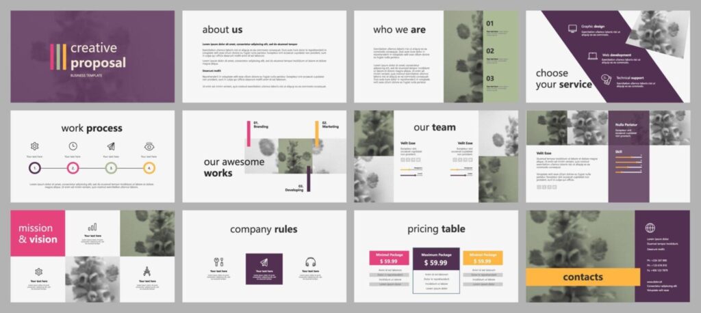
The internet gives us many choices, and this has changed how businesses operate. Instead of trying to attract everyone, we now understand the importance of focusing on a specific group of customers who really appreciate what we offer. These are the people who understand and value our unique products or services.
Our websites are a place to showcase our accomplishments and our specialties. Things that make us stand out.
For example, there are many bakeries out there. But wouldn’t you want your customers to know that you won an award for the best-glazed doughnut this year or that your bakery is the only one in town that makes gluten-free croissants? Sharing this information on your website helps customers feel more comfortable about choosing to do business with you. When they browse through our website, they start to get to know us, which makes them feel more confident in working with us because they know what to expect.
What Changes Will You Implement?
After reading the 10 warning signs, take a fresh look at your website. Don’t let your hard work go to waste with a mediocre site. Your website can actually help you attract more customers.
Can you make adjustments to your website to show customers that you appreciate their visit?
Show your customers how your business can solve their problems.
Make it easy for them to get in touch with you.
Remember, your website is where your relationship with customers begins. Make sure your first impression is welcoming and personal.

